

.svg)
.svg)
.svg)

Shopobill switched to Webflow to speed up website development and reduce maintenance costs.
.webp)
Shopobill is a no-code SaaS platform that lets you improve media targeting and ROI by gamifying your digital promotions, validating consumer purchase behavior, and using real-time data.
They were looking for a new website that would be lightweight, modern, easy to update, and would save their internal teams' resources on scaling and maintaining the website long-term.
The Process
Process-wise, we utilised weekly sprints with well-defined deliverables and sync calls with Shopobill team to make sure they like the output and we’re on a schedule. But most of our communication was asynchronous, what let clients to take more passive role of observers and decision makers and focus on their product.The whole project consisted of three main stages:
- Design: We started by creating detailed wireframes, outlining the structure and layout of the website. We then explored the visual style for the future website, resulting in a vivid color palette, elements from their current branding, and memorable typography.
- Webflow development: Once the design was in place, we transferred it to Webflow using the same Relume blocks. And built a responsive website in just four days.
- Integrations and Custom code: We Integrated CRM software to improve lead management and a bit of code to pass email information from the website form to Shopobill's app signup page, making the sign-up process easier.
.webp)
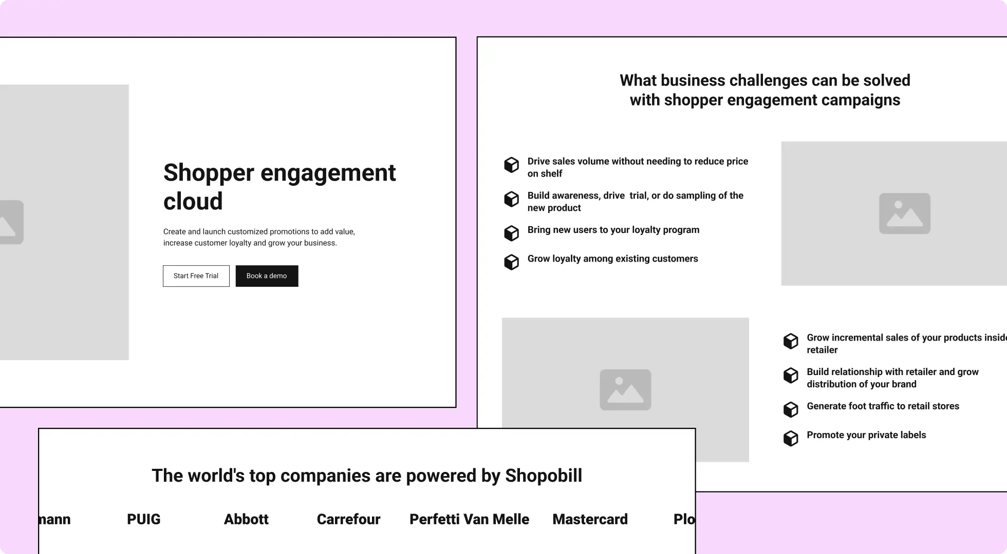
Blueprinting the future website
We started by creating detailed wireframes, outlining the structure and layout of the website based on detailed brief provided by Shopobill’s team.
To speed up the UI design and development process and make ongoing website updates easier, we used a library of pre-built blocks called Relume. Relume contains over 1000 components that can be used to create a variety of website layouts.
These components are easy to stylize, so we were able to create a custom look and feel for our website without having to start from scratch.
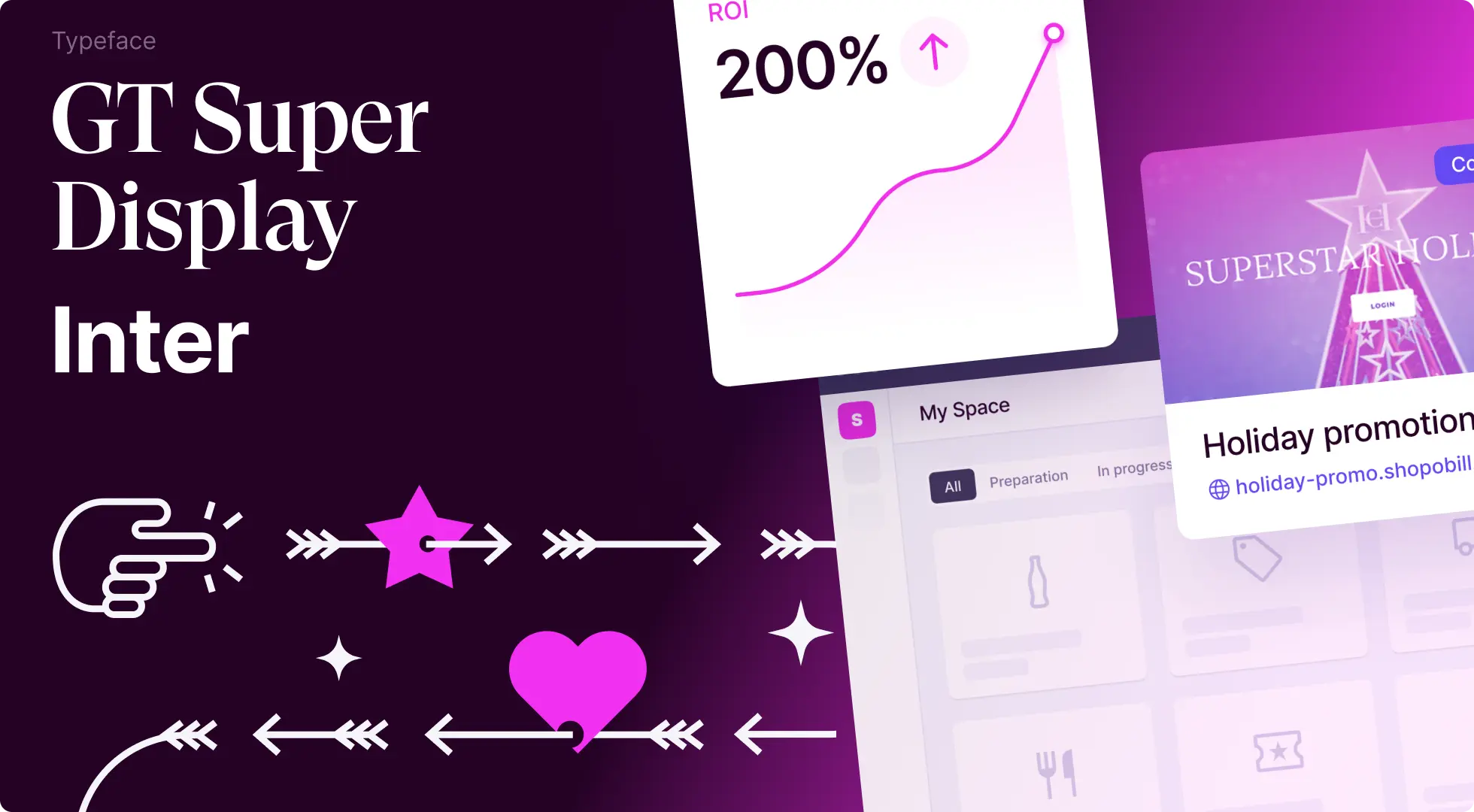
Look and feel
Once Shopobill's team was happy with the proposed structure, we started to explore the visual style for the future website.
We ended up with a vivid color palette, elements from their current branding, and memorable typography. This helped to create a visually appealing and engaging website that is consistent with their brand identity.
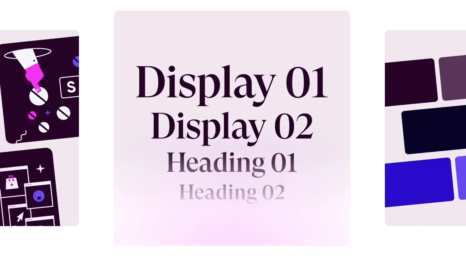
We then designed a comprehensive UI kit for Figma to create a strong foundation for future updates and ensure that the website would have a consistent look and feel across all pages. It would also make it easy to update and scale the website in the future.
The UI kit included all of the essential elements of the website, such as buttons, colors, text styles, and even entire sections. It was also designed to be modular, so that different elements could be easily swapped out or customized.
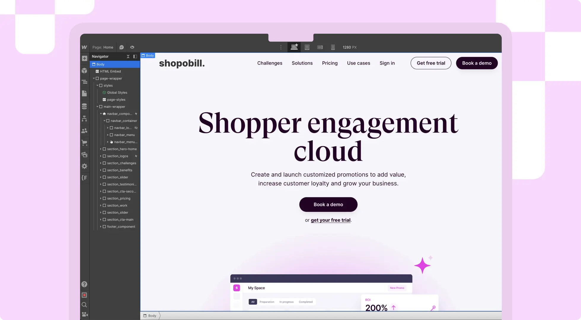
Webflow development
With the design in place, we transferred a UI kit to the Webflow and used the same Relume blocks to build a responsive website in just a four days.
We also implemented a simple on-scroll navbar button animation to change its style when visitors scrolled down the page.
This animation helps to focus visitors' attention on the call-to-action (CTA) on the hero section of the website. When visitors scroll down the page, the navbar button changes color and style, making it more prominent and attention-grabbing.
This simple animation adds a touch of interactivity to the website and helps to improve the user experience.
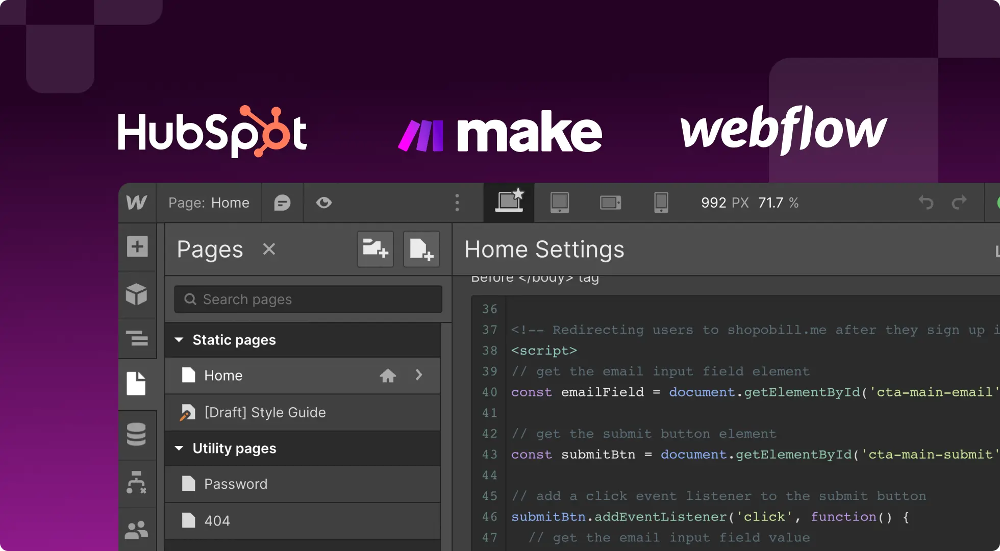
Hubspot Integration and custom code
The project goal was not only to create a Webflow website, but also to make it easier for the sales team to manage leads and drive new users to the platform.
To achieve this, we integrated HubSpot CRM with the website using Make, an automation tool. This integration allowed us to send lead data from Webflow to HubSpot CRM, so that the sales team can easily manage it.
In addition to the HubSpot integration, we also used a bit of JavaScript code to pass email parameters from the website form to Shopobill's app signup page. This helps to reduce sign-up friction and improve the user experience.

“Div Block Studio delivered a high-quality project on time and within budget. Their team was responsive and accessible, and their design and development skills made them a one-stop-shop for our needs.”
.svg)
.svg)
.svg)
.svg)

